Project Description:
ILLUMINATED LETTER: CONTEMPORARY COUNTER PART
An illumination is an embellishment, or additional decoration that enhances the pages of a written, or manuscript page. The decorated pages made it easy for missionaries to find the beginning of a particular section.
After understanding the history of the illumniated letter you will be explore the contemporary counterpart. Create a series (3) of illuminated letters based on the visual language of an artist(s), designer(s), architect(s) of your choosing.
Images:
Project Overview:
I learned about the art behind illuminated lettering as well as the history. I also learned how challenging it can be to work with a form as simple as a single letter....it was very fun though! Trying to match the artist's style without completely copying him/her was challenging but easily accomplished, and i just think the project itself was just ALOT of fun!!
Wednesday, December 8, 2010
Monday, November 22, 2010
Illumination: Word Lists
Jeremyville Word List:
1. Cartoon
2. Illustration
3. Dichromatic
4. Comedic
5. Characters
6. Urban
7. Print
8. Typography
9. Outline
10. Pattern
Eric Carle Word List:
1. Shape
2. Paper
3. Texture
4. Children
5. Book
6. Animals
7. Nature
8. Story
9. Cut and Paste
10. Negative Space
Salvador Dali Word List:
1. Surrealism
2. Dreams
3. Distortion
4. Subconscious
5. Nature
6. Landscape
7. Nightmare
8. Decay
9. Time
10. Uncomfortable
Wednesday, November 17, 2010
Tuesday, November 16, 2010
6 Chosen Artists
6 ARTISTS
1. Salvador Dali
2. Eric Carle
3. Vincent Van Gough
4. Walt Disney
5. Jeremeyville
6. Natalie Dee
FINAL THREE
I. JEREMYVILLE
Jeremyville is an artist, product designer, animator and human. He wrote and produced the first book in the world on designer toys called Vinyl Will Kill, published by IdN, interviewing peole like Fafi, Sarah from Colette, Baseman, Biskup, Pete Fowler, Jason Siu, Kinsey and Kozik.
He has been in a group show at Colette in 2007 alongside KAWS, Fafi, Futura, Mike Mills and Takashi Murakami. He has initiated the 'sketchel' custom art satchel project with artists like Beck, Genevieve Gauckler, Gary Baseman, and around 800 other artists.
His latest book is called 'Jeremyville Sessions', featuring collaborations with Geoff McFetridge, Miss Van, Devilrobots, STRANGEco, Lego, Converse, MTV and Adidas. His art has been published in design books by IdN, Die Gestalten Verlag, All Rights Reserved, Victionary, MTV, Magma Books, Kidrobot, Faesthetic, Laurence King, Taschen and Pictoplasma.
Jeremyville has worked with clients such as Converse, Rossignol, Colette, Coca Cola, MTV, Kidrobot, Refill, Graniph in Japan, Adio Shoes, STRANGEco, Wooster Collective, Super Rad Toys, Play Imaginative, sketchel, Adidas, Tiger Beer and Tiger Translate, Artoyz in Paris, Domestic Vinyl in Paris, Corbis, Thunderdog, Red Bull, Pop Cling, 55DSL and Beck.
He has appeared in magazines such as Swindle, Vapors, xlr8r, Wallpaper, Dazed and Confused, Nylon, Monster Children, Oyster, Computer Arts UK, Fused UK, Yen, IdN, Territory, Juxtapoz, The Drama, Beautiful Decay, 119, Xfuns, T World Journal, and Faesthetic.
Jeremyville splits his time between studios in Sydney Australia and New York City. He collects rare t-shirts, sneakers, toys and denim, and has a Converse x Jeremyville shoe released in late 2008.
EXAMPLE:
II. ERIC CARLE
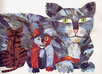
Eric Carle (born June 25, 1929) is a children's book author and illustrator who is most famous for his book The Very Hungry Caterpillar, which has been translated into over 48 languages. Since The Very Hungry Caterpillar was published in 1969, Eric Carle has illustrated more than 70 books, many best sellers, most of which he also wrote, and more than 103 million copies of his books have sold around the whole world.
Eric Carle’s art is distinctive and instantly recognizable. His art work is created in collage technique, using hand-painted papers, which he cuts and layers to form bright and colorful images. Many of his books have an added dimension—die-cut pages, twinkling lights as in The Very Lonely Firefly, even the lifelike sound of a cricket’s song as in The Very Quiet Cricket. Carle's readers often use his work as an example and create collages themselves that they often send to Carle; he receives hundreds of letters each week from his young admirers.
The themes of his stories are usually drawn from his extensive knowledge and love of nature— an interest shared by most small children. Carle attempts to make his books not only entertaining, but also to offer his readers the opportunity to learn something about the world around them. When writing, Carle attempts to recognize children's feelings, inquisitiveness and creativity, as well as stimulate their intellectual growth; it is for these reasons (in addition to his unique artwork) that many feel his books have been such a success.
EXAMPLE:
III. SALVADOR DALI
DalĂ, Salvador (1904-89): Spanish painter, sculptor, graphic artist, and designer. After passing through phases of Cubism, Futurism and Metaphysical painting, he joined the Surrealists in 1929 and his talent for self-publicity rapidly made him the most famous representative of the movement. Throughout his life he cultivated eccentricity and exhibitionism (one of his most famous acts was appearing in a diving suit at the opening of the London Surrealist exhibition in 1936), claiming that this was the source of his creative energy. He took over the Surrealist theory of automatism but transformed it into a more positive method which he named `critical paranoia'. According to this theory one should cultivate genuine delusion as in clinical paranoia while remaining residually aware at the back of one's mind that the control of the reason and will has been deliberately suspended. He claimed that this method should be used not only in artistic and poetical creation but also in the affairs of daily life. His paintings employed a meticulous academic technique that was contradicted by the unreal `dream' space he depicted and by the strangely hallucinatory characters of his imagery. He described his pictures as `hand-painted dream photographs' and had certain favorite and recurring images, such as the human figure with half-open drawers protruding from it, burning giraffes, and watches bent and flowing as if made from melting wax (The Persistence of Memory, MOMA, New York; 1931).
In 1937 DalĂ visited Italy and adopted a more traditional style; this together with his political views (he was a supporter of General Franco) led Breton to expel him from the Surrealist ranks. He moved to the USA in 1940 and remained there until 1955. During this time he devoted himself largely to self-publicity; his paintings were often on religious themes (The Crucifixion of St John of the Cross, Glasgow Art Gallery, 1951), although sexual subjects and pictures centring on his wife Gala were also continuing preoccupations. In 1955 he returned to Spain and in old age became a recluse.
Apart from painting, DalĂ's output included sculpture, book illustration, jewellery design, and work for the theatre. In collaboration with the director Luis Buñuel he also made the first Surrealist films---Un chien andalou (1929) and L'Age d'or (1930)---and he contributed a dream sequence to Alfred Hitchcock's Spellbound (1945). He also wrote a novel, Hidden Faces (1944) and several volumes of flamboyant autobiography. Although he is undoubtedly one of the most famous artists of the 20th century, his status is controversial; many critics consider that he did little if anything of consequence after his classic Surrealist works of the 1930s. There are museums devoted to DalĂ's work in Figueras, his home town in Spain, and in St Petersburg in Florida.
EXAMPLE:
Project Four - Illuminated Lettering
ILLUMINATED MANUSCRIPT
An illuminated manuscript is a manuscript in which the text is supplemented by the addition of decoration, such as decorated initials, borders (marginalia) and miniature illustrations. In the strictest definition of the term, an illuminated manuscript only refers to manuscripts decorated with gold or silver, but in both common usage and modern scholarship, the term is now used to refer to any decorated or illustrated manuscript from the Western traditions. Comparable Far Eastern works are always described as painted, as are Mesoamerican works. Islamic manuscripts are usually referred to as illuminated but can also be classified as painted.
The earliest surviving substantive illuminated manuscripts are from the period AD 400 to 600, initially produced in Italy and the Eastern Roman Empire. The significance of these works lies not only in their inherent art history value, but in the maintenance of a link of literacy offered by non-illuminated texts as well. Had it not been for the monastic scribes of Late Antiquity, the entire literature of Greece and Rome would have perished in Europe; as it was, the patterns of textual survivals were shaped by their usefulness to the severely constricted literate group of Christians. The very existence of illuminated manuscripts as a way of giving stature and commemoration to ancient documents may have been largely responsible for their preservation in an era when barbarian hordes had overrun continental Europe and ruling classes were no longer literate.
The majority of surviving manuscripts are from the Middle Ages, although many illuminated manuscripts survive from the Renaissance, along with a very limited number from Late Antiquity. The majority of these manuscripts are of a religious nature. However, especially from the 13th century onward, an increasing number of secular texts were illuminated. Most illuminated manuscripts were created as codices, which had superseded scrolls. A very few illuminated manuscript fragments survive on papyrus, which does not last nearly as long as vellum or parchment. Most medieval manuscripts, illuminated or not, were written on parchment (most commonly of calf, sheep, or goat skin), but most manuscripts important enough to illuminate were written on the best quality of parchment, called vellum.
Beginning in the late Middle Ages manuscripts began to be produced on paper. Very early printed books were sometimes produced with spaces left for rubrics and miniatures, or were given illuminated initials, or decorations in the margin, but the introduction of printing rapidly led to the decline of illumination. Illuminated manuscripts continued to be produced in the early 16th century, but in much smaller numbers, mostly for the very wealthy.
The decoration of this page from a French Book of Hours, ca.1400, includes a miniature, initials and borders
Manuscripts are among the most common items to survive from the Middle Ages; many thousands survive. They are also the best surviving specimens of medieval painting, and the best preserved. Indeed, for many areas and time periods, they are the only surviving examples of painting.
HISTORY
Art historians classify illuminated manuscripts into their historic periods and types, including (but not limited to): Late Antique, Insular, Carolingian manuscripts, Ottonian manuscripts, Romanesque manuscripts, Gothic manuscripts, and Renaissance manuscripts. There are a few examples from later periods. The type of book that was most often heavily and richly illuminated, sometimes known as a "display-book", varied between periods. In the first millennium these were most likely to be Gospel Books. The Romanesque period saw the creation of many huge illuminated complete Bibles – one in Sweden requires three librarians to lift it. Many Psalters were also heavily illuminated in both this and the Gothic period. Finally, the Book of Hours, very commonly the personal devotional book of a wealthy layperson, was often richly illuminated in the Gothic period. Other books, both liturgical and not, continued to be illuminated at all periods. The Byzantine world also continued to produce manuscripts in its own style, versions of which spread to other Orthodox and Eastern Christian areas. See Medieval art for other regions, periods and types.
The Gothic period, which generally saw an increase in the production of these beautiful artifacts, also saw more secular works such as chronicles and works of literature illuminated. Wealthy people began to build up personal libraries; Philip the Bold, Duke of Burgundy, who probably had the largest personal library of his time in the mid-15th century, is estimated to have had about 600 illuminated manuscripts, whilst a number of his friends and relations had several dozen.
Up to the twelfth century, most manuscripts were produced in monasteries in order to add to the library or after receiving a commission from a wealthy patron. Larger monasteries often contained separate areas for the monks who specialized in the production of manuscripts called a scriptorium. Within the walls of a scriptorium were individualized areas where a monk could sit and work on a manuscript without being disturbed by his fellow brethren. If no scriptorium was available “separate little rooms were assigned to book copying; they were situated in such a way that each scribe had to himself a window open to the cloister walk.” The separation of these monks from the rest of the cloister indicates just how revered these monks were within their society.
By the fourteenth century, however, the cloisters of monks writing away in the scriptorium had given way to commercial scriptoria in the larger cities. These cities included Paris, Rome and areas up in the Netherlands. While the process of creating an illuminated manuscript stayed the same, the move from monasteries to commercial settings was a radical step. As demand for manuscripts grew monks discovered that they could not keep up with the demand and “Monastic libraries…began employing secular scribes and illuminators to collaborate in book production.” These individuals often lived close to the monastery and in certain instances dressed as monks whenever they entered the monastery, but were allowed to leave at the end of the day. In reality, illuminators were by no means anonymous, and historians know "the names and addresses of very many late medieval miniaturists and illuminators."
First, the manuscript was “sent to the rubricator, who added (in red or other colors) the titles, headlines, the initials of chapters and sections, the notes and so on; and then – if the book was to be illustrated – it was sent to the illuminator." In the case of manuscripts that were sold commercially, the writing would “undoubtedly have been discussed initially between the patron and the scribe (or the scribe’s agent,) but by the time that the written gathering were sent off to the illuminator there was no longer any scope for innovation.”
TEXT
In the making of an illuminated manuscript, the text was usually written first. Sheets of parchment or vellum, animal hides specially prepared for writing, were cut down to the appropriate size. After the general layout of the page was planned (e.g., initial capital, borders), the page was lightly ruled with a pointed stick, and the scribe went to work with ink-pot and either sharpened quill feather or reed pen.
The script depended on local customs and tastes. The sturdy Roman letters of the early Middle Ages gradually gave way to scripts such as Uncial and half-Uncial, especially in the British Isles, where distinctive scripts such as insular majuscule and insular minuscule developed. Stocky, richly textured blackletter was first seen around the 13th century and was particularly popular in the later Middle Ages. Palaeography is the study of historical handwritten scripts, and codicology the related study of other physical aspects of manuscript codexes.
One of the most important features in the production of an illuminated manuscript is the amount of time that was spent in the pre-production stages outlining the work. Prior to the days of such careful planning, “A typical black-letter page of these Gothic years would show a page in which the lettering was cramped and crowded into a format dominated by huge ornamented capitals that descended from uncial forms or by illustrations.” To prevent such poorly made manuscripts and illuminations from occurring a script was typically supplied first, “and blank spaces were left for the decoration. This pre-supposes very careful planning by the scribe even before he put pen to parchment.” If the scribe and the illuminator were separate labors the planning period allowed for adequate space to be given to each individual.
EXAMPLES:
Monday, November 1, 2010
Thursday, October 7, 2010
Thursday, September 30, 2010
TYPE Paper
TYPOGRAPHY
1000 words on history:
Bodoni is a series of serif typefaces first designed by Giambattista Bodoni (1740–1813) in 1798. The typeface is classified as didone modern. Bodoni followed the ideas of John Baskerville, as found in the printing type Baskerville, that of increased stroke contrast and a more vertical, slightly condensed, upper case, but taking them to a more extreme conclusion. Bodoni had a long career and his designs evolved and differed, ending with a typeface of narrower underlying structure with flat, unbracketed serifs, extreme contrast between thick and thin strokes, and an overall geometric construction. Though these later designs are rightfully called "modern", the earlier designs are "transitional". Among digital versions, there are two good examples of the earlier, transitional period: Sumner Stone's ITC Bodoni, and GĂĽnther Lange's "Bodoni Old Face" for Berthold. Virtually all other versions are based on Bodoni's most extreme late manner.
Bodoni admired the work of John Baskerville and studied in detail the designs of French type founders Pierre Simon Fournier and Firmin Didot. Although he drew inspiration from the work of these designers,[citation needed] above all from Didot, no doubt Bodoni found his own style for his typefaces, which deservedly gained worldwide acceptance among printers.
Some digital versions of Bodoni are said to suffer from a particular kind of legibility degradation known as "dazzle" caused by the alternating thick and thin strokes, particularly from the thin strokes being very thin at small point sizes. This only occurs when display versions are used at text sizes, and it is also true of much display type that is used at text sizes. Non-dazzling versions of Bodoni that are intended to be used at text size are "Bodoni Old Face", optimized for 9 points, and ITC Bodoni 12 (for 12 points) and ITC Bodoni 7 (for 7 points).
There have been many revivals of the Bodoni typeface; ATF Bodoni and Bauer Bodoni are two of the more successful. ATF Bodoni was drawn by Morris Fuller Bentonin 1907, and released by American Type Founders. The Bauer version was drawn by Heinrich Jost in 1926. The Bauer version emphasizes the extreme contrast between hairline and main stroke. ATF captured the flavor of Bodoni’s original while emphasizing legibility rather than trying to push against the limits of printing technology. Other revivals include Bodoni Antiqua, Bodoni Old Face, ITC Bodoni Seventy Two, ITC Bodoni Six, ITC Bodoni Twelve, Bodoni MT, LTC Bodoni 175, WTC Our Bodoni, Bodoni EF, Bodoni Classico, and TS Bodoni. Zuzana Licko's Filosofia is considered by some to be a revival of Bodoni, but it is a highly personal, stylish, and stylized spinoff, rather than a revival. Although intended to be usable at text sizes, it represents the early period of the designer's career when interletter spacing was yet to be conquered, so has found use primarily in advertising.
Digital Bodonis typically suffer from a particular kind of legibility degradation. Personal computers generate different sizes of type from a single font of type outlines using mathematical scaling, while printers working with metal type use fonts whose designs have been subtly adjusted to provide optical compensation for improved legibility at specific sizes—for example, opening up counters and expanding the character widths at small sizes. Typefaces like Bodoni tend to highlight these differences of technological application. Many digital revivals are based on designs adjusted for relatively large sizes, making the already thin hairlines very thin when scaled down. Some digital type designers are rediscovering the older lore of "optical scaling", and subsequently turning out more sensible revivals aimed at pleasing human eyes. The most important and extensive effort in this respect is Sumner Stone's version of Bodoni for three sizes (7 point, 12 point, 72 point): ITC Bodoni. Another important Bodoni optimized for book printing (9 point) is GĂĽnther Gerhard Lange's "Bodoni Old Face" from the Berthold library. Most other versions are best used at display sizes.
Bodoni is a typeface designed by Giambattista Bodoni (February 16, 1740 in Saluzzo – November 29, 1813 in Parma), an Italian engraver, publisher, printer and typographer of high repute. Bodoni was appointed printer to the court of Parma in 1768. The Bodoni Museum, named for the artisan, was opened in Parma in 1963.
Giambattista Bodoni achieved an unprecedented level of technical refinement, allowing him to faithfully reproduce letterforms with very thin "hairlines", standing in sharp contrast to the thicker lines constituting the main stems of the characters. His printing reflected an aesthetic of plain, unadorned style, combined with purity of materials. This style attracted many admirers and imitators, surpassing the popularity of French typographers such as Philippe Grandjean and Pierre Simon Fournier.
The serifs of Bodoni, in addition to being very thin, are also nearly perpendicular to the main stem, as opposed to the gently sloping serifs of the so-called "oldstyle" typefaces. In addition, the emphasis of stress is very nearly vertical. The result is an overall clean, yet somewhat cold, appearance, both loved and hated by typographers.
Bodoni's original designs are periodically revived by new font designers. Indeed, during the age of metal type, every serious foundry had its own adaptation of Bodoni. Thus, today there is not a single typeface design called "Bodoni", but a range of adaptations, each with its own distinctive flavour.
Some adaptions, such as Bauer Bodoni, emphasize the extreme contrast between hairline and main stroke, which can be made considerably more pronounced using modern techniques of typography and printing than even the most skilled work of the 18th century. In text sizes, such hairlines almost disappear visually, resulting in reduced legibility.
Other designs, such as the ATF Bodoni designed by Morris Fuller Benton, capture the flavor of Bodoni's printing, emphasizing legibility rather than trying to push against the limits of printing technology.
Bodoni typefaces can sometimes suffer from a particular kind of legibility degradation known as "dazzle" caused by the thick vertical lines.
Bodoni forms the basis of a number of corporate identities, notably IBM.
Most current digital font systems generate different sizes of type from a single design using mathematically precise scaling, while printers working with metal type invariably adjusted the designs subtly for different sizes, for example opening up counters and expanding the width in small sizes. Typefaces of the Bodoni family tend to stress this difference. Many digital revivals are based on designs adjusted for large sizes, making the already thin hairlines even thinner. Some digital typographers are rediscovering the older lore of "optical scaling", and we can look forward to new revivals designed more to please the eye than to satisfy mathematical principles.
Bodoni
The radical Modern-style types of Giambattista Bodoni arrived on the typographic scene in Europe in about 1787. Bodoni was determined to produce letterforms of great beauty. His type has a strong vertical stress, an abrupt contrast between the thick and thin letter strokes, and slightly concave hairline, bracketed serifs. Bodoni has been revived by many type founders during the 20th century, including Linotype (1914-16) and Monotype (1921). The Bauer version was chosen because it is regarded as being close to the original 18th century design and is widely available in a range of widths, weights and italics. The strong vertical stress of the type demands generous leading. The display types called Poster Bodoni ad Ultra Bodoni are not directly related to the original Bodoni design.
500 on GIAMBASTISTA BODONI
Giambattista Bodoni (February 26, 1740 in Saluzzo – November 29, 1813 in Parma) was an Italian engraver, publisher, printer and typographer of high repute remembered for designing a family of different typefaces called Bodoni.
Early years and the Vatican
Bodoni came from a printmaking background, his father and grandfather both being in that trade.[1] He worked for a time as an apprentice in the Vatican's Propaganda Fideprinting house in Rome. There, it was said he impressed his superiors so much with his eagerness to learn, studiousness in mastery of ancient languages and types, and energy of effort, that he was allowed to place his own name on his first books, a Coptic Missal and a version of the Tibetan alphabet
Working for prominent families
After a battle of malaria put Bodoni out of commission for a while, he was hired by the Duke Ferdinand of Bourbon-Parma to organize a printing house in Parma, to be one of the great houses of Italy, called la Stamperia Reale. Bodoni got to work publicizing the house with the creation of specimen books, which were very well received amongst the upper classes of European capitals.[1] Soon, fine editions of classical and respected works followed, such as Homer's works and Gerusalemme Liberata of Torquato Tasso. Eventually his success was such that he was permitted to open a printing house under his own name, Officina Bodoni.
Bodoni achieved an unprecedented level of technical refinement, allowing him to faithfully reproduce letterforms with very thin "hairlines", standing in sharp contrast to the thicker lines constituting the main stems of the characters. He became known for his designs of pseudoclassical typefaces and highly styled editions some considered more apt "to be admired for typeface and layout, not to be studied or read."[2] His printing reflected an aesthetic of plain, unadorned style, combined with purity of materials. This style attracted many admirers and imitators, surpassing the popularity of French typographers such as Philippe Grandjean and Pierre Simon Fournier.
Unflagged by his famous rivalry with Didot, in his life Bodoni designed and personally engraved 298 typefaces, and the various printing houses he managed produced roughly 1,200 fine editions
Bodoni Museum
The Bodoni Museum, named for the artisan, was opened in Parma, Italy in 1963.The museum is entirely devoted to the typographer Giambattista Bodoni, who invented new typographical characters, later known as Bodonian, and as the head of Parma Royal Printing Works from 1768, managed to transform it in an international printing centre endowed with excellent quality standards.
HOURS
Free guided tours from Monday to Friday from 9.00am to 1.00pm only by prebooking. On Saturday visit by payment only by prebooking tel. +39 0521240259.
Closed: Sunday and festivities; closed from 16 to 31 August.
ENTRANCE FEES
Free entrance from Monday to Friday, by payment on Saturday.
HOW TO GET THERE
The museum is located on the first floor of the Pilotta Palace, in the historical center, 10 minutes walk from the railway station and 5 minutes walk from Piazza Garibaldi.
Here are preserved about 80.000 original tools and items: punches, presses, perforating dies, the original matrixes and boxes of alphabet of the Printing Works, still used today for printing particularly precious works.
In the archive is kept a collection of works and rare prints: among them, the most precious is certainly the greek version of Iliad printed in 1808.
WHAT HAPPENED IN 1740?
The War of the Austrian Succession (1740-1748) involved nearly all the powers of Europe (except for the Polish-Lithuanian Commonwealth and the Ottoman Empire). The war began under the pretext that Maria Theresa of Austria was ineligible to succeed to the Habsburg thrones, because Salic law precluded royal inheritance by a woman, though in reality this was a convenient excuse put forward by Prussia and France to challenge Habsburg power. Austria was supported by Great Britain and the Dutch Republic, the traditional enemies of France, as well as the Kingdom of Sardinia and Saxony. France and Prussia were allied with the Electorate of Bavaria. The war ended with the Treaty of Aix-la-Chapelle in 1748. The most enduring military historical interest and importance of the war lies in the struggle of Prussia and the Habsburg monarchs for the region of Silesia. The war also caused the French monarchy to fall heavily into debt.
BIBLIOGRAPHY
http://en.wikipedia.org/wiki/Bodoni
“Revival of the Fittest” by Phillip B. Meyers (c) 2000
“The Complete Typographer -- A manual for designing with type” by Christopher Perfect (c) 1992
http://timelines.com/1740/war-of-austrian-succession
Tuesday, September 28, 2010
Styles of Type
_ Old Style: Old style type is generally considered "warm" or friendly, thanks to its origins in Renaissance humanism. The main characteristics of old style typefaces are low contrast with diagonal stress, and cove or "bracketed" serifs (serifs with a rounded join to the stem of the letter).
_ Transitional: A refinement of Old Style forms, this style forms the transition between Renaissance Old Style and Modern typefaces. With the change from the woodcut to copperplate engravings in the 17th Century, the lines of the letters became more fine and rich in contrast. The thick-to -thin relationships were exaggerated, and the brackets were lightened.
_ Modern: Modern typefaces arose with the distribution of copper and steel engraving techniques in the 17th and 18th Century. The appearance is technical exact. Modern types are named Didone after Didot and Bodoni.
_ Slab Serif: At the beginning of the 19th Century typefaces for attracting attention were in demand for advertising, posters, flyers, business and private printed matters. Egyptian and Grotesque typefaces arose from Modern typefaces. The name Egyptian is derived from its use in a publication about booty from Napoleon’s Egyptian campaign.
_ Sans Serif:
*GEOMETRIC: Sans-serif typefaces influenced by the Bauhaus movement and featuring circular or geometric letters, with little variation in stroke thickness. * Some sans-serif types are built around geometric forms. In Futura, designed by Paul Renner in 1927, the Os are perfect circles, and the peaks of the A and M are sharp triangles.
*HUMANIST: Sans-serif typefaces with oval shapes and variations in stroke thickness to create a more graceful, human appearance. *Sans-serif typefaces became common in the twentieth century. Gill Sans, designed by Eric Gill in 1928, has humanist characteristics. Note the small, lilting counter in the letter a , and the calligraphic variations in line weight.
*GROTESQUE: The first sans-serif designs developed in the 19th century, and considered grotesque by the English. *Helvetica, designed by Max Miedinger in 1957, is one of the world's most widely used typefaces. Its uniform, upright character makes it similar to transitional serif letters. These fonts are also referred to as "anonymous sans serif"
_ Script: Script typefaces are based upon the varied and often fluid stroke created by handwriting. They are organized into highly regular formal types similar to cursive writing and looser, more casual scripts.
_ Blackletter: Black letter, also known as Gothic script or Gothic minuscule, was a script used throughout Western Europe from approximately 1150 to well into the 17th century. It continued to be used for the German language until the 20th century. Fraktur is a notable script of this type, and sometimes the entire group of faces is known as Fraktur. Black letter is sometimes called Old English, but it is not to be confused with the Old English language, despite the popular, though mistaken, belief that it was written with black letter. The Old English (or Anglo-Saxon) language predates black letter by many centuries, and was itself written in the insular script.
_ Grunge: “Grunge” derives from “grungy” meaning that it is dirty. It was first coined to stand for a specific type of music, a style that is influenced by punk, rock and heavy metal.
Given its definition, it shouldn’t surprise you if grunge is usually associated with a design that is aggressive, disorganized, and dirty.
_ Monospaced: A monospaced font, also called a fixed-pitch or non-proportional font, is a font whose letters and characters each occupy the same amount of horizontal space.[1] This contrasts to variable-width fonts, where the letters differ in size to one another.
_ Undeclared: Fonts that do not comfortably fit in any of the above categories.
Tuesday, September 7, 2010
Adrian Frutiger is a very well known typographical designer in the 20th Century. He has been a leading force in the typeface industry for years and is best known for his creation of the Frutiger and Univers Fonts.
Frutiger first experienced his fascination with type in his youth when most text was fashioned out of metal on signs of building walls. This set his mind to pursue the greatest most efficient and easiest method of achieving legibility. After a while, text technology moved from the relief metal lettering to lettering produced by light and film one a flat surface. This was where Frutiger begins to work his magic.
With this new-found technology, Frutiger spawned the Univers Font which is so commonly used today and would soon grow to father many more variations of text which would skyrocket his name to the top of the list of contributors to the design on type!
Here's a direct quote from the man himself to illustrate what advice he has to offer: "From all these experiences the most important thing I have learned is that legibility and beauty stand close together and that type design, in its restraint, should be only felt but not perceived by the reader. In the course of my professional life I have aquired knowledge and manual skill. To pass on what I had learned and achieved to the next generation became a necessity."
The UNIVERS Font:
The Univers font is so popular because it has a simplicity that allows for very high legibility and can be applied to almost ANY typographical situation, BUT it also has a wide array of weights and typographic colors in its repertoire, giving it a unique variety once compared to other texts. So, it accomplishes both the job of being simple while simultaneously accomplishing the job of being unique and aesthetically pleasing. Very impressive!!
The UNIVERS Grid:
*Quoted from: http://saraminor.blogspot.com/2008/09/adrian-frutigers-univers.html *
"At the age of 16 Adrian Frutiger worked as an apprentice for a compositor for a printer near his hometown of Interlaken, Switzerland. Frutiger was born in 1928 and is one of the most prominent typeface designers around. With the early start to his career that he got from being an apprentice his moved on from that experience to attending the Zurich School of Arts and Crafts. One of the first jobs that he acquired after attending school in Zurich was a typefoundry job in Paris. He worked on moving typefaces used with traditional printing methods to the new phototypesetting technology that had been developed. At the same time Frutiger started designing original typefaces. Although he is most notably known for his Univers font Frutiger's first commercial font was President. Along with his famous Univers font he has created 17 typefaces.
Univers is Adrian Frutiger's most notable typeface. He created a typeface that allowed for variations of different weights all within the same family. A unique number system is also used to identify the different variations within the typeface. Right now the Univers type family consists of 44 faces, with 16 uniquely numbered weight, width, position combinations. 20 fonts have oblique positions. All of these different variations can be seen in the Univers grid. The grid shows the variations and how each variation differs slightly to get to the next."
Wednesday, September 1, 2010
Blog 2 :)
Alphabet Variation:
Weight: consists of bold and bold italic type. These are heavier in stroke weight than the Roman counterpart. There are also many other typefaces like medium and light and extra-bold and black
Width: Some typestyles include character widths which are more narrow than roman (condensed) and some are wider (extended).
Style: The available number of styles vary. They are based on the following visual qualities: character angle, character weight, and character width.
Measuring Type:
Point: used to measure height. Examples: the type size and the space between lines and/or paragraphs.
Pica: measure width. Specifically the width of a column or the space between columns.
X-Height: the height of the lowercase letters, excluding the ascenders and
descenders. The larger the x-height is in relation to the cap height, the larger the letters will look in comparison.
Cap Height: The distance from the top of the capital letter to the bottom.
Leading: vertical spacing between each line of type.
Points and picas are used to measure type because they are smaller increments than inches and millimeters. Thus they can be more accurate.
There are 72 points in an inch.
There are 6 picas in an inch.
There are 12 points in a pica.
36 points = approximately an inch.
Tuesday, August 24, 2010
Grid - consists of sets of alignments that serves as a guide for distributing elements across a space.
*Using a grid permits a designer to lay out enormous amounts of information, such as in a book or a series of catalogs, in substantially less time because many of the design considerations have been addressed in building the grid's structure. The grid also allows many individuals to collaborate on the same project or on series of related projects over time, without compromising established visual qualities from one project to the next.
Modular Grid - is a grid with four rows and four columns
Columns - are vertical alignments of type that create horizontal divisions between the margins.
Modules - are individual units of space separated by regular intervals that, when repeated across the page format, create columns and rows.
Margins - are the negative spaces between the format edge and the content, which surround and define the live area where type and images are arranged.
Flow-lines - are alignments that break the space into horizontal bands.
Gutter - blank space between columns.
Hierarchy - is the task of helping a reader understand information in a way that makes sense by organizing it in an order that allows the viewer to enter the typographic space and navigate it.
Typographic Color - a change in the rhythm, value, texture and weight of text that makes it either recede or be drawn forward to the eye and can sometimes dramatically change the hierarchy of the text.
*Good organization is key to achieving good hierarchy. Grouping like subject matter together and aligning them in an aesthetically pleasing manner will give the work a balanced feel. Shifting something out of alignment immediately draws attention to it (which can sometimes be good) Size also plays a significant role. Larger items are viewed as if they are in the foreground, thus receiving more attention. While smaller items are viewed further back and are less noticeable.
Subscribe to:
Posts (Atom)