INDEX -- defined by some sensory feature, A, (directly visible, audible, smellable, etc) that correlates with and thus implies or `points to' B.
SYMBOL -- word-to-word relationships (sometimes called word-associates) are critical for anchoring the meaning of a word without depending on a correlation in space and time between the sound of the word and its meaning.
Conclusion.
Signs have:
1) a signal aspect, some physical pattern (eg, a sound or visible shape) and
2) a meaning - some semantic content that is implied or `brought to mind'
Where:
Icons have a physical resemblance between the signal and the meaning
Indices have a correlation in space and time with its meaning.
Symbols (content words like nouns, verbs and adjectives) are (sound) patterns) that get meaning:
-- primarily from its mental association with other symbols and
-- secondarily from its correlation with environmental patterns.
VISUAL EXAMPLES:

SIGN - This sign has a specific meaning that prohibits smoking, and it easily understood.

INDEX - The sight of dark clouds to the west is an INDEX of an upcoming rainstorm.

SYMBOL - This image represents the idea of "peace." It is not an image of "peace" itself, but merely a symbol that holds its meaning.
What makes a successful book jacket?
THREE EXAMPLES:

I think that this cover in particular really displays how great ILLUSTRATIONS work on a cover. So many modern books use photography and other medias when designing their covers and I think that what most need to realize is that illustrating your cover can be very effective as well if executed properly.

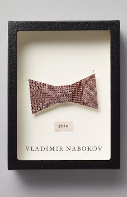
Here is a good example of an image focused cover. It is very simple (not overly busy/complicated) and it captures your interest. Personally, I want to know what kind of role the bow-tie plays in this story. It gives the book character and spunk. I enjoy it!

Moving on, I think this cover is a good Type-based example. It takes the other direction that the previous cover avoided and fills the picture plane with text. But the texture and mood the type sets for the novel really make up the "uumpf" behind this cover. It text is very stoic and solid and makes for a serious read. I like it!
No comments:
Post a Comment